이미지 관련 !!!!!
1. Image Shapes : 말그대로 이미지 모양!!
순서대로 rounded - rounded-circle - img-thumbnail
<h2>Image Shapes</h2>
        <div class="row">
            <div class="col-sm ">
                <img src="../bootstrap/images/images.jpg" class="rounded w-100 h-100" alt="rounded"/>
            </div>

            <div class="col-sm mt-2 mb-2"> <!--상하 여백 주기 -->
                <img src="../bootstrap/images/images.jpg" class="rounded-circle w-100 h-100 " alt="rounded-circle"/>
            </div>

            <div class="col-sm">
                <img src="../bootstrap/images/images.jpg" class="img-thumbnail w-100 h-100 " alt="img-thumbnail"/>
            </div>
        </div>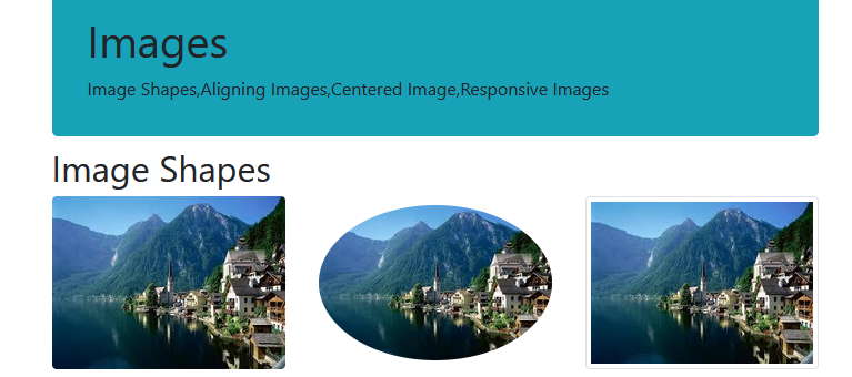
2. Aligning Images : 이미지도 정렬 할 수 있음 !! 오른쪽 왼쪽 가운데! (가운데 정렬적용하는 코드 특이하니 잘 봐둬 !!!!)
float- right
float-left
mx-auto d-block
  <h2>Aligning Images</h2>
       <div class="row">
         <div class="col">
            <img src="../bootstrap/images/images.jpg" class="float-right" alt="float-right" title="float-right"/>
            <img src="../bootstrap/images/images.jpg" class="float-left mt-2 mb-2 " alt="float-left" title="float-left"/>
            <img src="../bootstrap/images/images.jpg" class="mx-auto d-block" alt="mx-auto d-block" title="mx-auto d-block"/>
        </div>
       </div>
3. Responsive Images : 이미지도 반응형 !!
img-fluid 로 설정하는게 정석이나
img-thumbnail랑 founded-circle 를 적용해도 자동으로 반응형이 된다 !
<h2>Responsive Images</h2>
       <div class="row">
        <div class="col">
           <img src="../bootstrap/images/images.jpg" class="img-fluid w-100" alt="img-fluid"/>
       </div>
       </div>

       <div class="row mt-3">
        <div class="col">
           <img src="../bootstrap/images/images.jpg" class="rounded w-100" alt="rounded"/>  <!--fluid 안 줘도 자동으로 반응형이 되네?(img-thumbnail랑 founded-circle도 마찬가지) -->
        </div>
       </div>
Responsive Images
'학원 > BS(부트스트랩4)' 카테고리의 다른 글
| 11/14 42-7 [BS] Alerts (0) | 2022.11.14 |
|---|---|
| 11/14 42-6 [BS] Jumbotron (0) | 2022.11.14 |
| 11/14 42-4 [BS] Tables (0) | 2022.11.14 |
| 11/14 42-3 [BS] Colors (0) | 2022.11.14 |
| 11/14 42-2 [BS] Text/Typography (0) | 2022.11.14 |